The Challenge
Design the strategy for ferret’s first MVP,and validate the product flow before launching it to the market
The App's user interface (UI) had unintuitive commands and it lacked a proper Visual System
Ferret App
Ferret is a reputation and background checking mobile app that allows business professionals and businesses to monitor their contacts, customers, partners, vendors, and key individuals they engage with every day.
My Role
Lead Product Designer
My work on this project included the UX strategy for the creation of the MVP, designing the product Visual Concept and UI screens, as well as validating the product’s first assumptions, and guiding developers and stakeholders through the implementation process
Design Process
The process included the analysis of the app’s idea, defining the main user flows collaboratively with the PM and dev team, designing the user interface, and validating the first version of the product.
I started with a workshop to help the team structure and define the user flows. Together with the team, we defined the three main ones which were “onboarding & initials results”, “targeted search”, and “notifications”. This allowed me to create a functional prototype with the main paths to test and get user feedback.
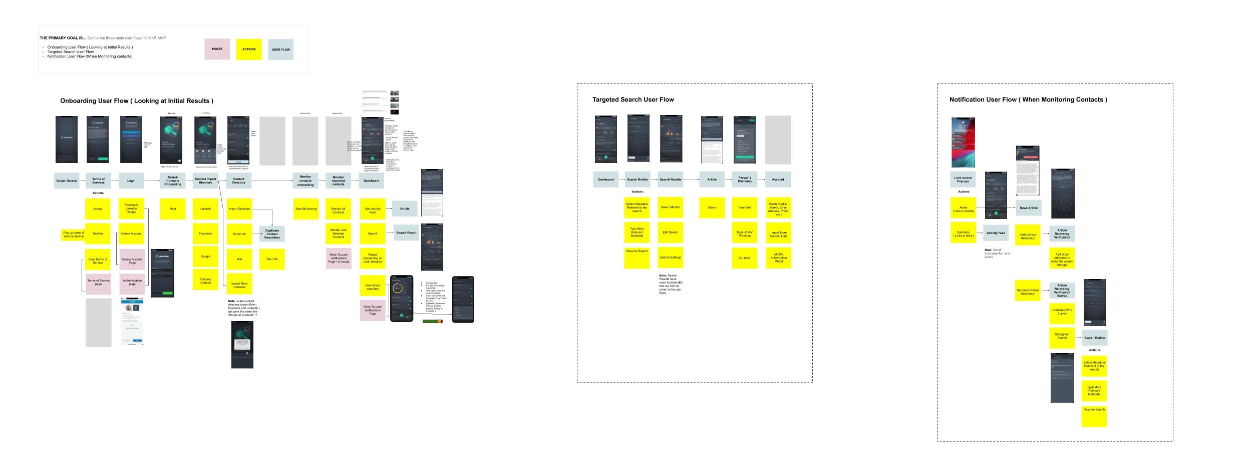
Ferret user flows “onboarding & initials results”, “targeted search”, and “notifications”.
My process consisted of the following:
● Analysis
● UI Design
● User Testing
● Development Handoff

UI Design
The first iteration of the UI Design consisted of creating the styling of the app, the component library, and high fidelity mock-ups of the three main user flows. The mocks had to follow a set of business requirements for further testings.
In addition to the app initial screens, a landing page was created for sales and promotion purposes
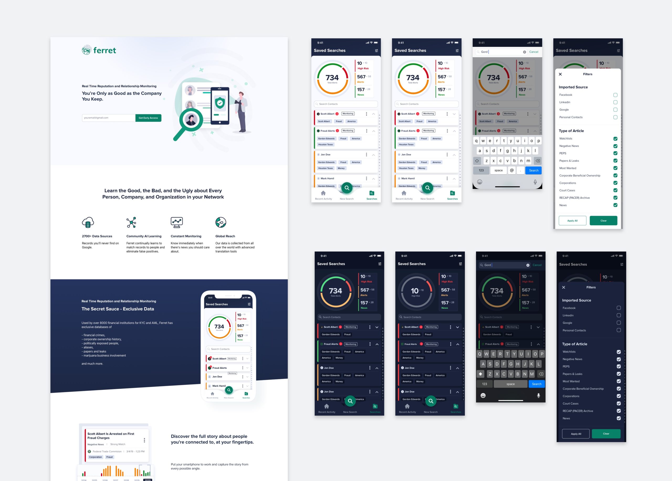
Ferret Landing page and UI Mocks for Saved Searches section
User Testing
I conducted 1 round of usability testings with potential users with the purpose to evaluate if users could understand the complexity of the app concept, assess usability issues that could hinder their experience, and see their overall navigation mental models.
Usability Testings
The results of the Usability testings were satisfactory with 77% of the tasks done successfully.
None the less I still found important pain points from the feedback gathered in each of the tasks.
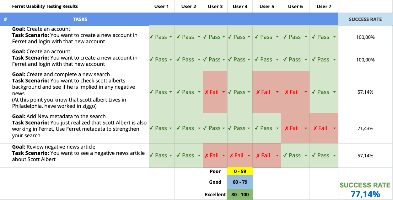
Ferret usability testings results ( Usability Testing Template )
After interpreted all the feedback, together with the team I facilitated a workshop to prioritize action items for the development and design team.
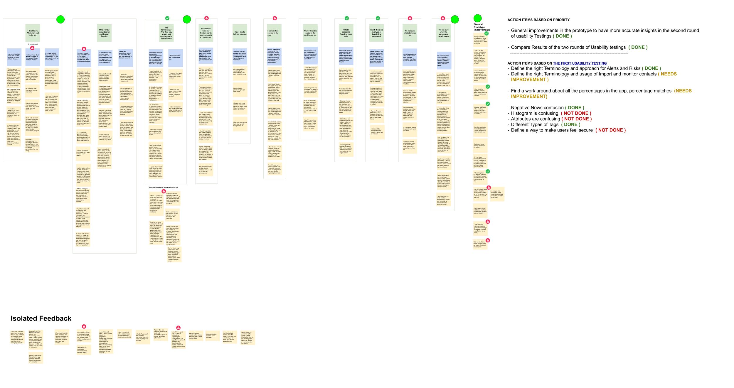
Interpreted Feedback from usability testings, with prioritized action items by the team ( Affinity Diagram Template )
Most Relevant Insights
1.- Alerts and risks where confusing for users
● The app's alert and risk system weren't intuitive. It led users to misunderstand how both of them worked and the relation between alerts and risks
● Users found the alerts feature hard to understand due to the lack of context they had at an early stage of the process.
2.- Search in the app used different mental models making it confusing for users
● Users weren’t using the search feature at first due to other misleading search components in the dashboard.
● Users thought they could only search for their contacts and couldn't find any place to find them and search for them
3.- Importing and monitoring was overwhelming for users
● Users found both flows ( importing and monitoring ) very repetitive and were confused when advancing since the UI was very similar
● The terminology and the way import and monitor worked was confusing to users
Design Improvements
From the prioritized action items from the feedback, I focused the design efforts on improving three critical areas in the app, Import contacts, Alert Filters, and onboarding experience.
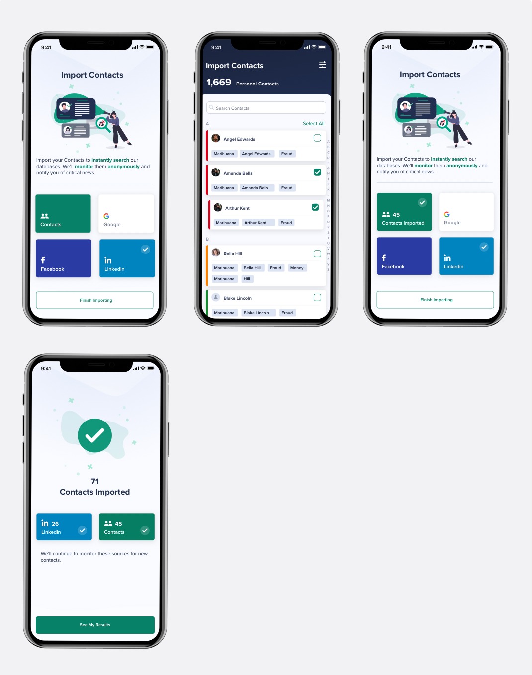
Import Contacts
In order to make the import contacts process more intuitive, we reduced the cognitive load for the users.
This stage had too many features that overwhelmed the experience. Non-essential elements were removed in order to create a more pleasant and smooth user experience.
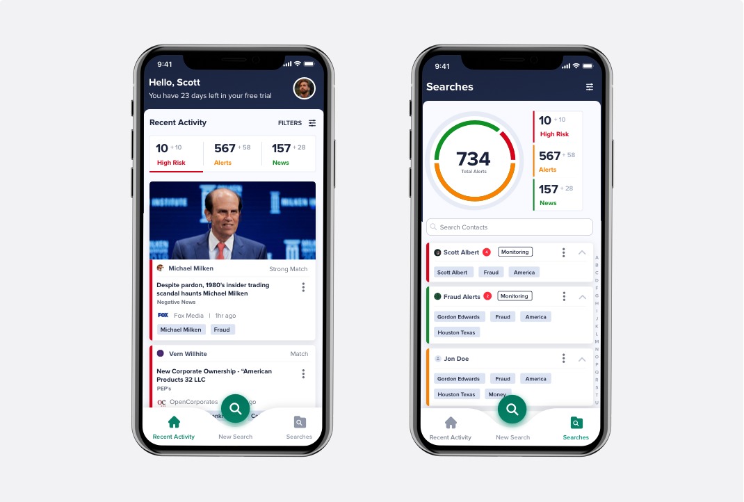
Alerts Filters
Users struggled with understanding the filters alerts. The solution was to change the terminology used in the titles and change the affordance of the UI components.
By changing the alerts titles and making the components of the filter look clickable we made it easier for users to identify and use the types of filters.
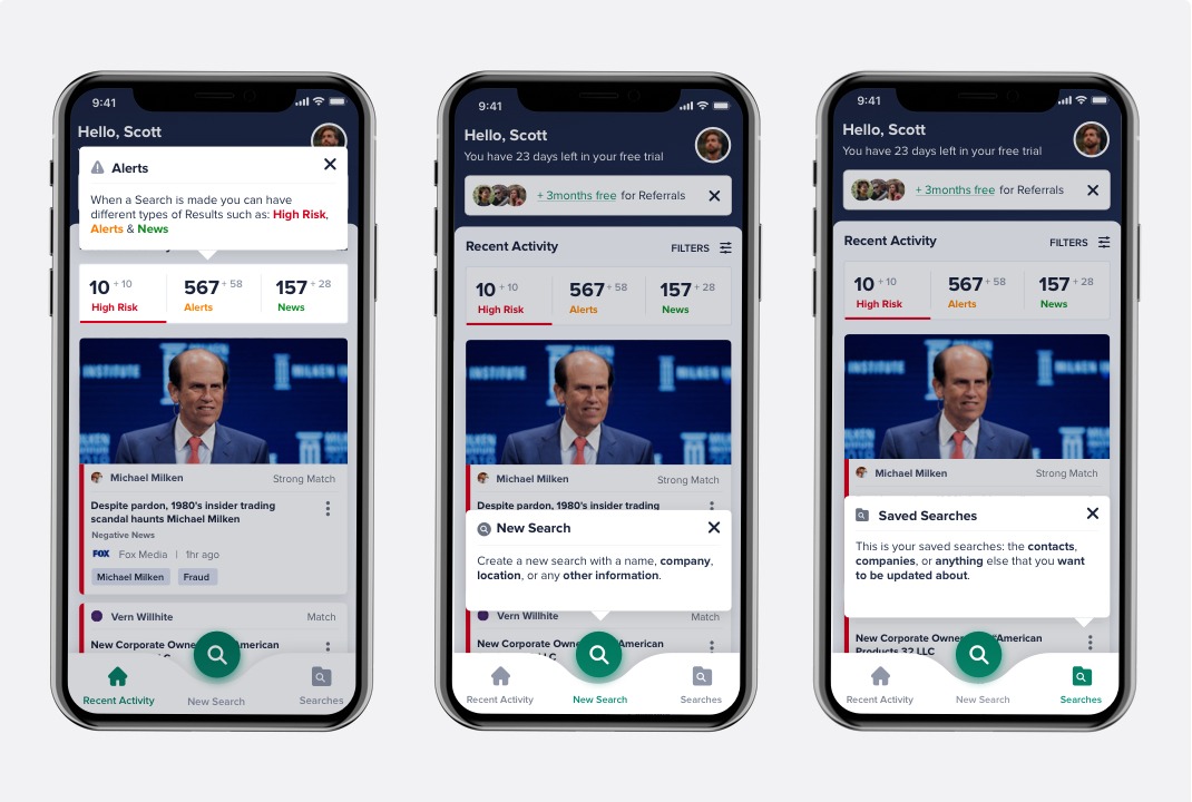
Ferret Onboarding Experience
In order to clarify how users could use the search feature as well as the Alerts filter, I designed a progressive onboarding explaining the main functionalities. In addition, removing the ability to search for contacts on the dashboard results to avoid confusion with the main search feature.
Let's Talk!
Feel Free to send me a line at mmedina.ldg@gmail.com